For the second stage of A2 media studies, as a class we re-made
the music video to Busted- That what I go to school for. In pre-production, we
appointed a director- the person who would tell everyone what to do- which was
Jordan. He then decided which people would play which parts and try to give
everyone a job. We didn’t appoint a specific person for the props role, and so
everyone was responsible for themselves which was not a good idea as some
people did not own school uniforms anymore which were required for the making
of the video so they couldn’t take part. If we had one person for the props job
then they could have made sure that everyone had the correct props and uniform
for the video. Jordan also appointed the singers randomly, instead of asking of
those who would have liked to play the parts which may have been better as some
people would have preferred those roles. In production there were times when a
lot of people were stood around and not doing anything, this caused a problem
because we did not involve everyone and only focused on the main singers and
the people who had uniform and not giving the others any jobs to do. I thought
it was not planned to a good standard and I have learnt that you should appoint
a props manager and find other people specific jobs such as location manager to
ensure that everyone has something to do and making sure that everyone has the
correct costumes and props so that everyone can participate and no one is left
with nothing to do.
When filming- the part where the two girls walk past in
particular shows the actual Busted video playing in the background, where it
should be white or blank (turned off)- this reminds me that during production, every little detail should be considered and making sure that it is all ready before we start to
film- such as turning off the projector for that particular shot. I have also
learn through production that we should record more than one take of each shot
because if I come to edit that shot and I don’t like it, then I have a back-up
shot which may or may not be better. A couple of the shots which we filmed for
this video were only taken once, so we had to use that shot i the video as we
had no back-ups, for example the second from last shot of the video. It would
of been good to had at least two shots to see which was better to use for that
particular bit. I have also learned about using the different shots in the production of each section, that all of then are not necessarily filmed using the tri-pod and are recorded being handheld. Also the different angles such as close up and low angles which help to make the video much more interesting. The main thing I have learnt is that I should know the order of the shots which we will be filming in. For example, the feet shot first, then the light switch and it does not have to be in chronological order as it all comes together in post-production.
In post-production I found it quite hard to fit all of the video clips in the time space of the actual music video. For example, at the start there are 3 small cuts before the first singer begins to sing - all in the space of 6 seconds. The cutting of the clips did not seem a problem, it was just making sure that they all fit within that timing and in the right place according to the actual busted video. It took a lot of time, but I finally managed it. I also noticed that the continuity was all over the place and that it did not seem to flow very well. This is partly because of the filming and that we filmed on different days amd the lighting was all different- which shows me that I should attempt to film on the same day, or to get the same lighting as the previous shot as on the shots of singer1 in the class and the shot of the projector -both has a dark atmosphere, but one is darker than the other which is not correct and both should be of the same darkness.
Overall as a whole class task I think we managed very well. The director was good and we made sure that all our shots were just like the original video and worked together to try and achieve the best we could.
For the first section of our A2 media studies year we were asked to create a lip sync music video to a well known classic song, we chose to do lip sync to Bon Jovi- Living on a prayer. We recorded the footage using a camera whilst actually singing and then removed the audio and edited the video clips the the music mp3.
From this task I found out that editing a music video is much harder than you first think. You have to fit the video and the music exactly right in order for the lyrics being spoken and the mouth movement to be in sync with each other. The filming was quite straight forward with the camera remaining still as we filmed which worked well, although we could have used a variety of different angles to make the video seem more interesting- but that was not the task so we did not feel the need to use fancy angles. The editing took a little bit of time to get used to and I learnt that you can edit out sound to video clips and how to cut and edit videos to suit the music in use. The programme we used was Adobe premier which was very useful as it helped to create a smooth flowing video, even though it was a bit slow and frustrating at times.
Before starting this task, I did a preliminary task, of which was to create a new student magazine. This helped me to get used to a lot of the technologies which I have further used in this task. Once the preliminary was marked and I received them, I wrote myself some targets and uploaded them to my blog in a blog post titled 'Targets':
"-Use more illustrations to illustrate research which will help develop a better understanding of what you can try to achieve.
- Design a more sophisticated cover design which is suitable for my chosen audience
- Use less intrusive text
- Detailed account of the technologies used in the creation of the product and research.
- take screen shots of the product in progress and keeping notes of anything difficult I have managed to achieve- i.e- text wrapping round an image."
when researching and planning I took these targets into consideration and this was able to guide me out of the things I did wrong in the preliminary task to create a more successful main task.
The video below shows me talking about how I have developed in technologies and knowledge since the preliminary.
Here is the script which I used in the video with the text in Blue any information I have added:
In my preliminary task, I only created two blog posts for my research. I only researched what I needed too and not more into the topic in which I was going to be creating a magazine for. I chose a few images and picked out the main focus points such as the masthead, colours and boost image, I did not really explain the conventions or look into it deeply as I was really quite unsure of what I had to do as it was all very new to me, therefore I struggled for the first couple of weeks as I was still getting to grips with how much work we had to do in so little time- however in the main task, I spent more time researching into the magazines of the genre of music I had decided to create my magazine on. I analysed them in more detail and also researched into the types of stories and articles which they write about, I was able to look at the websites for other copies of the magazine covers and compare them to see the key conventions of the different designs. I also researched into the different sub-genres of Jazz as it is a very broad genre and I felt that I had to focus on one specific sub-genre to makeit to the point, I also did much more research in the Main Task because as I am not a Magazine reader I wanted to make sure I was really clear of the types of this which I needed to include and the end product would potentially could look like. I did not plan my preliminary magazine to the best of my ability. I drew a few designs on paper and photographed them to put on my blog, but as I had never designed or created a magazine cover before, I did not really know what to do, so I went along with my instinct and using the research to complete the task and drawing my designs firstly seemed good because then I could see briefly what could create. For the main task, because I had done so much research into existing magazines I was able to design my cover in a detailed way and with the help of Timetoast I was able to create a personal timeline in which I could set deadlines for each section of work and when then had to be completed with the final deadline set by my teacher at the end. The fact that I drew several detailed designs on paper and photographed them to upload to my blog, and created computer mock-ups of the cover, I knew exactly what I was going to do and how to do it.
To organise my time wisely and effectively I used an internet programme called Time Toast which was really beneficial as I was able to create a timeline of dates in which I had created to ensure that I knew when I had to complete each sub-task by. I did not do any time time management in the preliminary task which was not very good because it meant that I did not do much work for a few weeks and then at the time of the final deadline, I had to do a lot of work in such a short space of time, which was very stressful. Time management is important because I will then know when I need to complete certain things and these deadlines and dates can be fitted around other things in advanced so I can ensure I have time at the end to touch up on anything which is incomplete.
In the preliminary task I was very careless about how I used the camera and did not really take the time to think about the angles, lighting and the way the model looked. The thing I did like was that it looked very natural which shows that the magazine was independent. I took some time whilst taking the photographs to think about the angle and trying to see which would be the best angle to take them, however I think I could of done more preparation of this before I had started to take the photographs. For my main task I took more time looking into the different angles which I could take. When taking them I took several photographs at the different angles I had thought and planned of, to which I then chose the best images to use for each section of my magazine. Furthermore I took much more time and consideration into the lighting of the images, and especially the boost image and making sure there back no shadow behind the model.
The conventions of the magazines for both my preliminary and Main task have very similar conventions which alot of magazines, despite the subject which they are made for they all use the same conventions to attract their target audience such as a larger masthead, splash, bar-code, date, price, reversed out cover-lines one boost image as the center of attraction and many cover-stories to inform and give an idea of what to expect inside the magazine. I followed the majority of these conventions, however when it came to cover-stories, I only included a few to connote the higher-class audience of my target audience whereas on the preliminary I used much more Cover-stories and used reversed-out cover-lines as I was trying to target an audience which was completely different.
I created both the preliminary and main task magazines on Adobe Indesign with using Photoshop to either edit and transform all my photographs which I had taken. The first time I had used Indesign (a desktop publisher) was on the preliminary task and it did not take me long to work out the basics of how to use it with a little help from my teacher. Once I knew the basics of how to insert text and images I was able to carry on with creating my magazine. I had used photoshop before, so that was no trouble to use. The only thing I could do was top up my skills over what I already knew, one of these of which was learning how to view and create a double page spread and also how to text wrap writing round boxes and images which was really beneficial. I also learned during the preliminary of the programme Prezi which creates interesting Powerpoints, and I have further used this programme in the main task. One programme I used in the main task, and was new to me in this one was the programme Time Toast which was very simple to use. Overall I have used so much technology and different programmes in both the Preliminary and Main task to create the two magazines. Many of the programmes such as Powerpoint and Photoshop I had used before and also being introduced with new programmes like Indesgn and Prezi which will now come in useful with everything I do. The improved use of photoshop to edit and manipulate images has grown as I have learnt so much more techniques I could use to make my images to look better, an example of this is the saturation levels which is taking out some of the colour. I used this on my boost image and contents image to connote a more formal look which would appeal to upper-class person. The manipulation of images took time and there were times where things did not work. I did not do any image manipulation in the preliminary because I felt that I did not need to edit anything with the images I had taken. The bright images would attract the audience type I targeted and the background was very important with the subject it was based around so editing the images did not seem necessary.
The process of both tasks really heavily rests on the feedback from your target audience. The target audience was the core of all the ideas I came up with, and importantly they had to fit and connote the audience profile I had created. Throughout the main task I referred to my Audience focus group of people from my target audience for their feedback of each step that I took to ensure it agreed with them and that it suited them and if not then I had the feedback to change the components which did not work. I found that the more I turned to my focus group for positive and negative feedback, the more successful and real looking my magazine became. Also the feedback from my boost image model was very helpful as they were able to identify the flaws of the cover and whether things worked or not round his face and whether I needed to add anything else onto the cover to make it more appealing or to keep it simple to connote a more sophisticated audience and if it appealed to them. The feedback and advice given really affected the decisions about what I did throughout the process of the production. An example of this is with the boost image. I took a total of 32 images and them selected 13 to show to my target audience. I then asked for their view on the photos and which one they thought would best suit the boost image. Their thoughts really counted as it was the image they chose which they would most like to see on the cover which would most appeal to them. The help of the decision was really beneficial because the straight answers of their feedback suggested that this image stood out against the others and it really appealed to them as my target audience. Another example was with the contrast of the boost image after I had changed the contrast of the colour in photoshop. One of the images was lighter and the other darker to which I asked my audience to say which one they preferred and which would connote them as an audience altogether. They chose the darker image as it looked more sophisticated and formal, but also suggested that I changed the saturation of the image to take out some of the colour which I took their advise and it really highlighted the image as traditional which connoted my audience as sophisticated and upper-class.
The biggest thing I have learnt whilst on the journey to completing these tasks was how important you should plan your time is. I have realised that setting personal deadlines helps you to get through the sub-tasks at a good rate with leaving yourself plenty of time at the end to go back if anything did not get finished or did not go the way you wanted to make it more successful. Deadlines also help to complete everything to the best of you ability as you have realised that you have to complete this task for this date and you do not leave everything to the last minute before the final deadline and you have to rush through things in order to get them done to meet this.
I think I have improved from the targets I set. The first one states that I should use more images to illustrate research. I took plenty of images of Wire magazine for my research to analyse the conventions which it had. I was also able to refer back to all these images to calculate and review exactly what I needed to include and whether I wanted to challenge anything and how I was going to do this. In the preliminary I got feedback that my cover was not very practical for the audience I had chosen, to ensure the cover for my main task suited my target audience, I took a long time to research and analyse existing magazines and my target audience, so I knew exactly what I was going to do. Also the use of feedback from my focus group allowed me to create a successful magazine which appealed to them. The third target was to use less intrusive text. To overcome this, I stuck to traditional old-style, serif text to connote a sophisticated audience which is clear to read and does not take over the whole magazine. As shown in question number 6, I have described what technologies I used and how I used them in much more detail which was target number 4. The last target I created was that I needed to take pictures of the process of my magazine. With everything new that I did to my magazine I screen shot it and imported that into photoshop and saved as a JPEG to use in my evaluation. I did this with every step which I took and it has helped me greatly when writing up my evaluation. So overall I think I have improved quite a lot from the preliminary as I have made sure I have understood and researched really well before designing and then creating my magazine which has made the process easier as through the research I came up with so many ideas.
4) Who would be the audience of your media product?
The audience for my media product are 40-55 year old, Class B , Radicals who do not like to follow the mainstream crowd of mainstream music as Jazz is not very popular amongst those types of people.
Also I am targeting radicals who do not want to follow the crowd, but to go their own way and listen to the music which suits them, even if it is not too everyone taste. Overall people who like the genre of music which I have based my magazine on.
I also have a secondary audience of young adults below this age category for people who are really passionate about this genre of music.
The magazine is aimed at both genders and this is because although the majority of the artists I researched were male, the Jazz genre is not gender specific and is liked and loved by both genders so therefore the magazine I created is suitable for both male and females. My magazine should also interest those who play musical instruments and as it is not mainstream should attract those who are strongly passionate.
The people I am targeting Shop at Marks and Spencer, Julian Graves, Waitrose because the quality of products are much better and they think they deserve the higher-standard. They buy their shoes at Elts because they are pure leather and will last longer as they know how to dress properly.Secondary audience shop at H&M because they do not like to follow the crowd and can be individuals here. He or She play musical instruments such as guitars and Saxophones because they are widely interested in the genre.They attend smaller concerts and festivals because it is what they like and are small because they are not known about or mainstream as they are not advertised as greatly as festivals such as Download or Glastonbury.They go to the theatre often to hear new artists or to watch small shows. Listen too artists such as Roy harper, Diana Krall and Chet Baker because they produce the music which they are interested in. They are the type of people who do not care if they forget their mobile phone, or do not have much interest with the computer. Are an older generation as they may have grown up to like this genre of music and is very peaceful and relaxing which is what they may want or need. Have a busy lifestyle, and to listen when they get home to calm themselves down. People who do not feel intimidated by younger, more mainstream people.
5) How did you attract/address your audience?
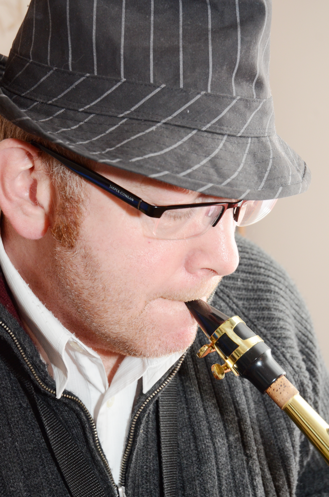
I think that I was successful in attracting my target audience. I showed my finished front cover, Contents and double page spread to 3 Jazz music loving inspirer's of my target audience, two of which are from my focus group and the response was generally really positive. Through the stereotypical use of the saxophone all 3 were able to identify the genre of the magazine, being Jazz and could not recall seeing any similar magazine like this in the shops in which they go too.
To attract my audience I used saturated images which connoted a traditional, old-style magazine which fitted to the genre of the music that has dated back to the early 1900s, therefore only the audience who are interested in this field would notice the magazine and pick it up whereas others would just walk past it. The dominant male images may suggest that the Magazine is aimed at males. This is wrong as the photographs do not show direct contact with the camera and the models therefore look less intimidating and therefore appeal to both genders. Also Jazz is not a biased genre so it should be about the music and not the people who create it. The whole magazine is about one specific genre of music which is straight to the point and gives detailed articles to the reader. My double page spread is about a 14 year old who has used emergent ideology to create music by using a instrument which is not stereotypically known for this from of music. This is suited for my audience because it explains that you do not have to be of the age of the target audience to create music for them as it is the music which they want to listen too and are interested in and not the age of the musician.
The preferred reading of my magazine is that it takes a deeper look into the meaning and the people associated with the Genre of music I based my product on and the fact it is all about the contents and not the design of how the content is presented. The colours used connote a higher-class audience who would more than likely pick up this magazine in one of the chosen shops rather than a wacky mainstream magazine such as KERRANG which use bold and striking colours to attract the hard metal/rock fans.
Below is a video of a voice recording of Mark from my target audience. I asked him various questions about my magazine and this is what he said:
Below is an image of feedback off facebook from Alex Foden who was also part of my focus group who is the secondary audience to my magazine:
Below is an image of an email from someone who is below both my definite target audience and also my secondary audience. As someone who is not into this type of music, the feedback response was very different
The feedback I received was really positive. All of the people who I asked for feedback off were able to recognize the fact that it is for both genders (although I only asked males they were still able to identify this). To ensure that this was the case, the photographs that I took ensured that direct contact with the camera did not exist. The fact that the boost image and the two images on the double page spread are all looking away from the camera and looking down/straight forward makes them less intimidating and dominating and therefore appeals to both gender audiences. They all stated that my magazine did look real with the choice of images I used which I purposely edited to gain the effect of a upper-market feel and look- the realism of the magazine is really empathised when Alex compares it too Grazia, and although this is aimed at a different genders and also is based on a different subject, the type of people they are aimed at are really similar and being compared to an existing magazine is amazing and it puts out that I have been able to target an upper-class sophisticated audience just as I would of liked too.
I tried to use a varied range of article and cover-stories with events and other Jazz -related aspects in the contents page. The content is used was totally relevant to my target audience and all the Articles are about about musicians with some pages about Jazz related festivals and how to learn a desired instrument which works well. The feedback I received for this from Tom (The younger age range than secondary audience) is very blunt as he states that the content appeals to both genders, whereas as a music lover, Alex explains that the content is appropriate because the fact I had written quite a lot reflects on my audience and that they would have the motivation to sit and read all of it which they may enjoy. The distinct difference of opinions shows the sort of audience I have attracted too and the out of target audience people who I have asked have looked at it because it has been put in front of them. I chose to write more information on the contents page and double page spread for this reason. As my target audience is older generated people, I respect that they are more likely to read more than those in the teens or early twentys. They seem to have more time to do things and I thought that reading would be one of their interests and if they are interested in the genre of music then they would be more likely to sit and read the article I have written.
The mode of address seemed to be good with the response from my target audience. I tried to use a more formal language in the text to connote a higher-class audience as I stereotypically thought that they would be more educated to speak more formally. I also used saturated images to address the audience as a traditional, old style magazine which will appeal to the older generation as this reflects off the age of the genre itself dating back to the 1900s.
The feedback for the font also seemed very positive with Tom saying 'Yes' to that it is appropriate and Alex and Mark saying that it looks traditional but bold and clear. I used a serif, old-style font to connote and heighten the age of the genre which reflects off the age of the target audience. Im not saying their 100 years old , or as old as the genre but showing that the font will more appeal to an older generation than those of a younger age. From the font my audience were able to recognise straight away that the magazine is aimed at an older more upper-class audience.
From feedback it also seemed apparent that my audience also thought that the colours in which I used were used appropriately. from the comments of the boost image and it looking 'Sepia' connotes the sophistication of my audience. From my research I made sure that the colours really suited the audience and which colours would be best to use. In this case, as I was targeting an older audience of 40-55 year olds, it seemed that saturated images were the best to connote this audience type as it appealed to them more than brightened pictures did. I made sure that throughout the double page spread and the contents page that the text and background apart from the images remained black and white. This allowed the pages to be read more easily and connoted an audience type who is only interested in the content of the magazine and not the way it looks. An audience who wants all the information put straight in front of them and so they do not have to search for it as it just is not in their nature.
The comments I received on the layout show opinions such as 'The layout makes it seem easy to understand' shows how I have created a simplistic layout with all the information it needs for a mature audience who would rather read the information on its own than crowded with a lot of photos and other text. One comment suggested I added one more photo to the cover to illustrate some of the cover-stories. I only had the boost image on the cover as through research I found that only having a few cover-stories to the side was a good idea to connote a sophisticated and upper-class audience who prefer the content to the design of the cover whereas if I used a variety of reversed-out cover lines and splash then I was afraid that it would connote my magazine cover more as mainstream.
Overall, from the feedback I was given I think that my magazine was successful. I think that the simple colour scheme and layout really connoted the sophisticated, mature and upper-class audience I was hoping to target. The use of colours also connotes a traditionalist audience and heightens that of the genre and how far it dates back to, which is implied by the style of font I used too.
Magazines use either symbiotic or synergistic links to distributors to distribute the magazine to stores and retailers throughout the country and world. Depending on the type of magazine and the target audience, the way in which they distribute the magazine may be different whether they use a mainstream or independent distributor.
Mainstream magazines such as Kerrang use one of the 4 main distributors (Marketforce, Frontline,Comag and Seymour) with networks to distribute their magazines to major retail outlets and online platforms. Frontline is one of these who sells and distributes over 160 of their shareholders publisher magazine titles which includes 58 of the top 200 selling in the UK. They are able to supply 480 million copies of the magazines to distribute to over 55000 retail outlets. The objective of Frontline is to give the best chance of selling the magazines at the lowest price possible.
The scale is alot larger than those of a independent supplier. This is the process in which they work:
One Magzine frontline distribute with a synergistic link to the publisher Bauer is the magazine Q. They recall that this magazine is the biggest selling monthly music magazine with an audience of passionate, engaged and open minded music fans who are open to continually discover new msuic. The main social group for Q is males, with a staggering 75% of the audience being male and 25% female.
My magazine is not mainstream, so this is not the distribution technique I would use to distribute my magazine. I will use an independent distribtor to distribte the magazine I have created to certain shops. My magazine is aimed at B, higher-class audiences who tend to shop at the more expensive places such as Waitrose. Therefore there is no need for my magazine to be advertised in places such as Tesco or Asda becase my target audience will not pick these types of shops as their first choice.
An example of an independent distibted magazine is Vice which is a high class magazine of which the audience is young adults ages 18-23 with 38% of the audience falling into this category, 36% in 24-29, 16% in 30-35 and under 18 only 8%. This shows that the magazine is more suited to a younger audience. The is hardly any difference in the gender audience with 49 % being female and 51% being male which shows it is more or less a unisex magazine aimed at both genders. Dominantly it is aimed at people who love music.
An Independent distributor strategy is different to mainstream ones because these magazine may only be available in certain stores accross the ountry. For example, Vice is only found in stores in 10 cities/towns across Britain, the nearest to us being in Birmingham. This means that the reader has to be really commited to the magazine to go over to Birmingham to buy the latest isse or any of the other 9 cities accross the country.
I have chosen to use an independent strategy because my magazine is for an up-market audience who will not be seen shopping in some of the stores which most mainstream magazines are sold in. Also as it is up-market it should be treasured and commited people to the magazine and the genre would take time to go and buy the latest issue, which is why I propose that it is only sold it certain stores, much like Vice magazine. I will distribute my magazine to higher-class shops such as waitrose and certain music shops around the country.
The platforms I will use is the paper copy of the magazine and the website where you can order/subscribe to the magazine for it to be sent to your door. I will not be have an online version as this could make it become mainstream if people start to read it online as it will be too easy to access for mainstreamers.
The distribution strategy will not come cheaply. As I have decided that my magazine should only be sold in certain shops, it will only attract the audience who are really interested in the genre and the upper-class audience. This involves using no real advertisement to ensure that it does not become mainstream and is kept to inspirers and traditionalists. The profit will come to how much my target audience like the magazine and how successful it is without any real advertisement.
The initial deadline for the production work was the 3rd February 2012. I managed to meet this deadline by completing my pages in lesson and uploading most of the posts and feedback at home. A lot of the posts were adding pictures and then gathering the feedback from various sources, like facebook and word of mouth to insert into the posts for each stage of the process.
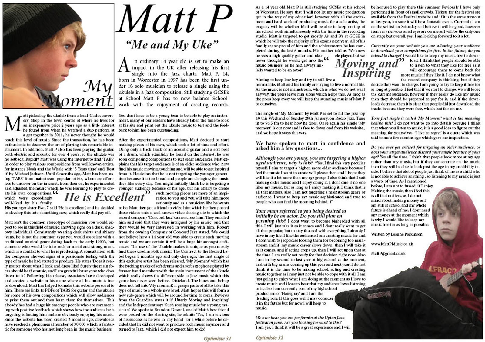
The images show my double page spread. each image shows one page with the bind in the middle. In context, the images would be closer together so 'Breaking margins:"me and my Uke"' can be read more flowingly.
This is my final design for my contents page. As the image shows, it is a very basic colour, which is shown throughout, as my target audience should potentially only be interested in the content of the magazine and not the colour and design of everything.
This is my final design for my magazine front cover. It has very few cover-lines to connote a sophisticated audience and that the cover is not the main aspect of the magazine, but the content which is inside.
I Had created two double page spreads with two different titles and headings and I asked my focus group of which one they preferred.
The heading of the first one is long and goes across the two pages. My focus group said that this takes a lot longer to read because of it spreading over the two pages.
The second one has a short heading underneath the name of the artist. This is a lot easier to read, even if you are just glancing through the magazine and catch the heading to which you may want to read further.
After inserting this image, I then presented my double page to my Focus group.
The feedback I received:
Alan- I like how it is set out in columns and gives it the real magazine feel. The top picture is very basic which is good to catch the eye of the audience. Overall I think it is very good.
Mark- I Like how Matt is sat in the corner as it gives the pages a very personal feel. The text wrap round the quotes is a really good idea and works well. I do not think that conventional magazines have the website so big. I would suggest that it is smaller.
Alex- Looks awesome, the contrast between the two pictures shows a connection and the title of 'My Moment' really reflects on his story in the article. I am a bit confused whether it is a review or a biography type- could you make this more obvious?
Alistair- Its all right. (unfortunately Alistair is having a few family problems at the moment so I was not able to get any feedback from him for this.)
Mildred- Very good, Matt was always very good at posing for pictures. The title of 'My moment' and the 4 stars suggests that this is an album review. I would suggest that you change this.
The writing is in 3 columns with the text size of font 10, which is fairly small which is what magazines use generally,
The white box in the top left will contain an image, but there has been a delay with taking this, so this will be attached soon.
The quotes i have written bigger and bolder to stand out helps to attract the audience in reading the article with the most interesting parts of the article which are quotes from people.
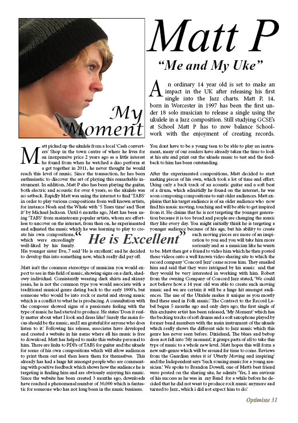
I have challenged the conventions of a typical Jazz magazine by writing my article about a young teenager. Even though he is young, he music is most suited to an older audience, and this article explains why. The music is the main thing which i listened to , not the artist, and although the artist should matter, if the audience likes the music then the artist being young should not matter.
For those enlarged quotes, I used text wrap to allow the text to be warped round the text. The image to the right shows how i text wrapped the image in in-design. It was easy to do and looks effective.
The pictures I used for my double page spread are of my second model, Matt. Like shown in a previous post, I saturated the images to make them look more classy and to suit my target audience. I used photo shop to delete the background to white, which proved to be quite difficult. The images below show the progression of the image fro the first to the one used.
This shows some of the grass attempted to be removed When I removed the grass
however it did not work very well and looked messy using the quick selection tool, it
took away the majority of the chair
Therefore i deleted the whole chair and placed Matt in the corner, which still connotes that same simplicity and seriousness of the music.
This was then inserted into in-design on my double page spread and I made the text go round it. As the background was white, text wrap would not work, so I used the enter key which seemed to work just as well.
I have used 3 different photos and images for my contents pages, and then asked for my focus groups' opinion for which one I will use as my final design. I left the background white to shows simplicity and to connote that higher-society people do not mind what colour the back ground is, or how full of pictures it is, but the information on the page is more important as that is what they want to read. The word 'Contents' to the top right and is not very big. I left it big enough to engage the audience and to let the know what page this is, and then the sate and issue number underneath. The contents itself is written in two columns with the main heading in a bigger font with the extra information I thought was necessary in a smaller font underneath. The page numbers are to the right and are very clear. I added a small border to the top left hand corner, round the picture(s) to add some detail but still keeping it plain and simple.
The first image i used, was the front cover boost image to show that both pages related and connected to each other. The feedback I received showed that this was not the best image to use and that i should use a ore varied range of pictures. 'Even though the standard use of the same picture will attract your audience, a range of pictures will help show a skill of what sort of things you can create.'
The second image I used was a less saturated image of the second most popular image for the cover image. I made it transparent in indesign using the transparency tool to show the border underneath. After putting in the picture to the page, i do not think that it connotes a very good image of my audience and that it looks a lot different to what I thought it would. The overall feedback I received from people suggested that this was not the best picture to use. It did not connote a good sophisticated audience and that it was too transparent.
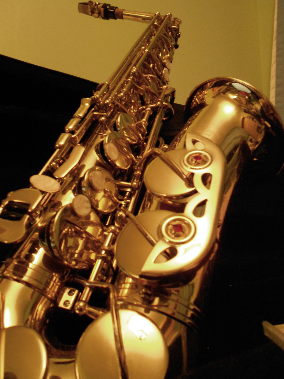
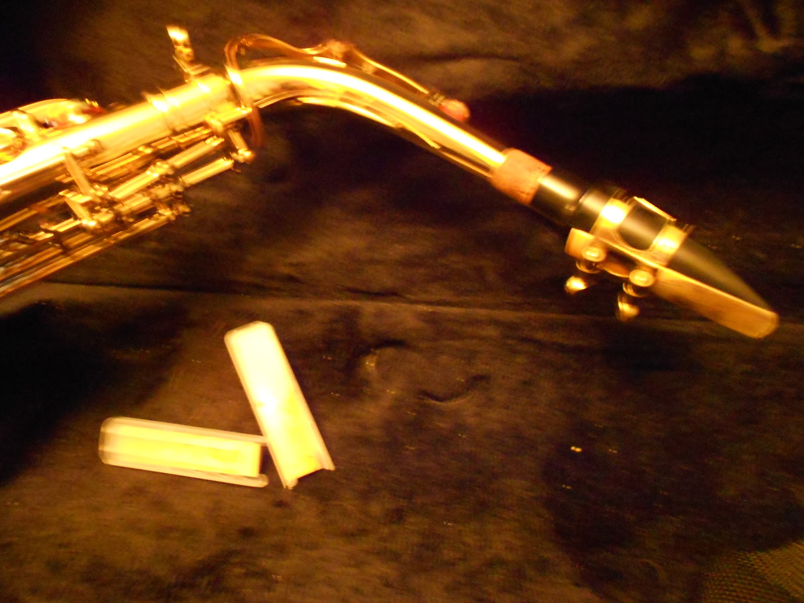
The third image I used was a picture of a saxophone with the camera angle at an angle pointing upwards. I did not alter this picture in any way. The picture is a little bit bigger than the other two but feedback suggests that it is preferred for this picture and that it shows a stereotypical view on Jazz, as when you think of this genre, you automatically think of a saxophone. Alistair says that the Saxophone works best because it shows the musical site and not the artists and that it is about the instruments used in the music as well as the artist him/herself.
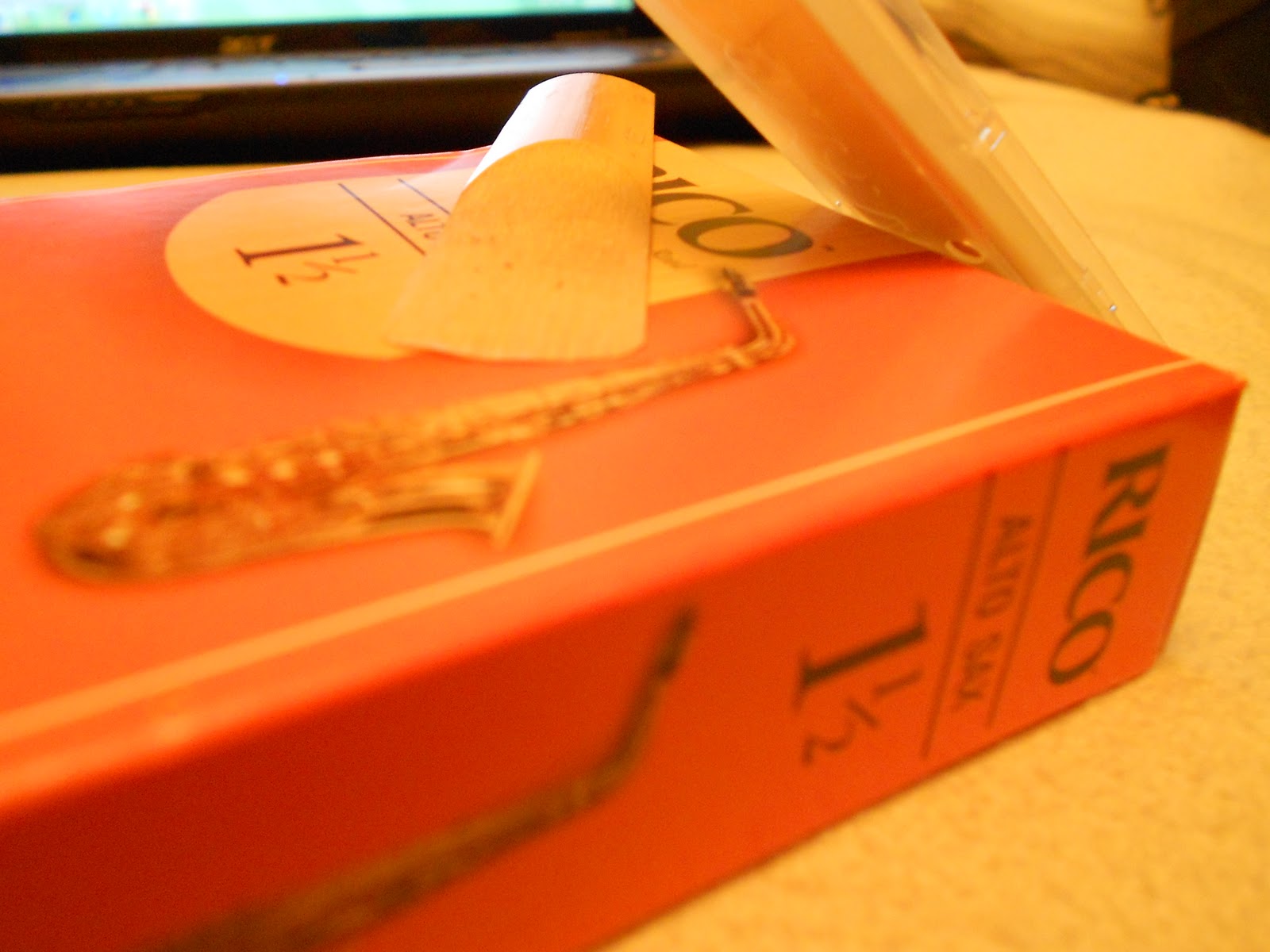
I chose this particular image of a saxophone from 5 images which I had taken... :
< The first image was too blurry, so this image was not able to be used
-The Second image (Left,Below) , I thought did not show enough detail on the saxophone, so this image was also discarded.
>The third image showed alot of detail and ad a camera angle which was angled upwards. -The 4th image (To the right) of the saxophone reeds and the box would not be suitable for my magazine as it does not portray the right conventions of the type of magazine I am producing and would be seen in a more middle class magazine. However if I was to produce a page with a shop or musical Lessons advertisements page then I would consider this. -The fifth image (to the left) of two reeds, does not only convey different conventions to the magazine I am producing, it is also blurred, and does not fit the style of my magazine. Therefore I will not be using this image.
Because of the disapopinting other 4 images, I used the third image.
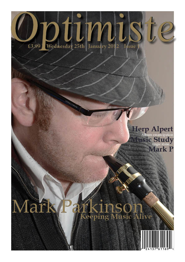
I then added and wrote my final cover-line of 'Mark Parkinson- Keeping music alive' and then asked for feedback from my focus group.
Alex- 'Looks very professional. The model is striking a good pose which is connected to the music genre of the magazine and connects to the audience in different ways.'
Alistair- 'its good, I like the way all the font colour contrasts well together and matches the colour of the saxophone and then the smaller, less important cover-lines are black and white.'
Mark- 'The way the colour of the font contrasts with the saturated image connotes a sophisticated audience. One thing I would suggest to change is the price. as the price you have put does not seem the sort of price you would give a higher-class magazine.'
Alan- 'It looks like a very formal cover which appeals to myself. I a not familiar with the cover-line artists, but it does not matter.'
Mildred-'Very good, you are clever. Mark has posed really well. I like the way he is positioned and how he is looking down and concentrating on the saxophone.The use of a few coverlines shows a simple design which will attract those of a higher society.'
The left picture shows my front cover with the darkened image without saturation. I got feedback from my Focus group and Mark and Alan both mentioned the fact that the picture was still a bit dark . I then inserted the saturated picture (right) and asked them to compare the two. Mark said that the cover with the saturated image looked a lot more attractive to my target audience and that it looked more mature to read which also shows its independence., rather than it being glossy and bright like mainstream magazines would look like. Alan said that the right picture was more suited to an older audience (which is what I am targeting) and also shows a upper-class magazine.
The pictures I have decided to use for my contents page ans the first one for my double page spread are of my two models and my saxophone.
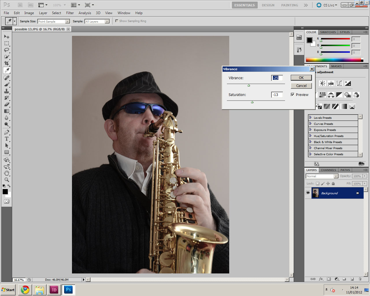
Again, just like the front cover boost image, I changed the saturation levels to suit the target audience. I also changed the vibrancy levels to make them clear to see which darkened/lightens them. This helps to connote a sophisticated and upper-class audience as it makes them look more mature, and not glossy and bright like a mainstream magazine would have.
The pictures show the images in photoshop and the window is of the saturation which I used to take some of the colour out of the images.
As I started to change the colour of the font on the boost image I found that the initial colors I had decided to use did were not visible. The first colors i tried were gray, which did not look sophisticated or stand out above the boost image. I then added a white back shadow to the text, which did not really help make it stand out any more.
Following the colour clash between the models hat and the colour of the text. I decided to try changing the text colour to the saxophone colour. This looked a lot better and connotes a more higher-class sophisticated audience.
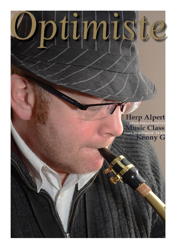
I then inserted The image chosen for my boost image into Indesign for the initial look into what my cover will look like. This was done with the lightened picture, as by this point i had not saturated it.
I also inserted the second most popular image into the scene too , this was to compare the both and to determine which looked better and the most suitable for my target audience.
After inserting both images, i decided to stick with the image originally chosen because it looked more professional and for a higher-class audience which is my target audience. My focus Group agreed with me and said that the original image they chose to be most suited was in fact the one which looked best.
The Boost after being lightened/darkened was then saturated in photoshop to give it a more professional and sophisticated look which connotes a traditional audience and highly mature.
The picture shows how i used the saturation level bar to take out some of the colour out of the image which makes it look like it it for a higher class audience rather than the image being bright or dark which connotes a different image.
The saturation was suggested after I inserted the darker image to my front cover which did not appeal to my target audience. Therefore changing the saturation levels helped the image look like it is aimed at a higher class. The image above shows my first attempt at the cover with the darker image which does not connote a sophisticated profile which is why I reverted to the saturation levels of the picture.
I have looked at the brightness and contrast of my boost Image and made it lighter and darker.. then asked for feedback on which one looked better.
< This is the original image which was selected.
This image has not been brightened or darkened, which is what I did in photo shop to see the effects and whether it made a difference
This is when I brightened the image >
Alex: I think that overall it looks good but it does not connote a sophisticated audience.
Alistair: looks good. although looks a bit too bright and I do not think it will appeal to your target audience.
Mildred: I do not like this picture as it is too bright, when you add the information for the stories , they may not be clear enough. A darker image would be most suitable.
<This is when I darkened the image.
Alex- 'I like this one better out of the too. It seems more professional and targets your audience more clearly.'
Alistair: This image looks a lot more professional than the other image you showed me.


.jpg)


