Tuesday 20 December 2011

Time Management

I have created a Time-Line with dates which I aim to complete each of the Research and Planning tasks. I will also be keeping a record of whether I met these deadline and what I have done to achieve them.

click on the dates and speech bubble to view for information


Wednesday 14 December 2011

Audience Research

I have created an audience profile into the types of people I will be aiming my magazine at.

Friday 2 December 2011

Initial research- Existing Magazines


After Researching into existing magazines of genres in the UK market, I have noticed that there is very few music magazines for the Jazz musical genre and that the majority of the magazines i have looked at are rock such as 'art rocker' and 'Kerrang' or pop such as 'smash hits.' In today's society many Jazz artists have been mixed into other music style magazines, such as Eliza Dolittle who is starring in pop magazines and there is nothing which brings them all together in one to show what they have achieved and done in the Jazz music industry.

Thursday 1 December 2011

Detailed Research into Forms and Conventions

I have chosen to focus on the music genre of Jazz and for the next task we have to research into the forms and conventions of two magazines, I have chosen to study 'Wire' and  'Downbeat' which are two independent Jazz magazines aimed at a small market and target audience.

The first magazine I studied was called 'Wire'
WIRE MAGAZINE

Wire is a magazine targeted at the over 35 age range. The magazine uses many techniques such as colour and content to ensure that it attracting the right audience.

Perhaps it is because the masthead is regular capital letters, spreading right across the page which allows the magazine to be taken seriously and the metaphor of the title ‘Wire’ connotes the unravelling of the music which the audience likes to open their insight into Jazz. The modern type letters reach the invisible cap height and are light grey in colour, with some transparency so the boost picture can still be seen behind. The use of the colour grey connotes simplicity and a sophisticated magazine which appeals to an upper market. In other issues, sans serif font is used to connote a different jazz genre and to appeal to a slightly different audience. The photograph of Roy Harper on the cover is a close up of his face. The picture has not been photo-shopped as you can see all the detail and colours in his face which shows that it is natural and organic, and not a manufactured magazine.


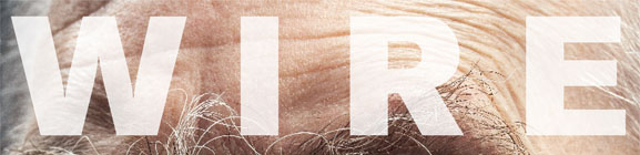
The colours used show a dull connotation and therefore appeals to more of the upmarket audience. The use of grey used in the title of ‘Wire’ and the grey beard of the boost picture contrast well with the black callouts situated on the right hand side of the cover. There are only 3 callouts which suggests that the magazine is independently made and they don’t need to spread out the content on the cover to interest the audience. The top callout ‘Roy Harper’ is written in uppercase letters and the kerning is loose. The fact that it is just a name suggests that the boost picture is of him but does not give any information as why he is in the magazine and that the audience will have to look inside to find out. The callouts underneath then decrease in size and the lack of them on the cover connotes the audience type and that they don’t need to include many callouts to attract their audience as the content is more important.

The content of Wire is a lot of sophisticated analysis of artists and the genre which connotes the maturity of the radical audience. There are many full page adverts promoting and advertising albums of artists who feature within the genre. Furthermore like mainstream magazines ‘wire’ do have CD reviews and interviews, however similarly the rest of the magazine it is still mature although the interviews use more colloquial language which shows the direct conversation of the interviewee and artist. Another reason to show that the magazine is independent is that there are websites which directs you to free downloads. The mode of address is a simple way with the boost picture on the cover being the main focus with a familiar face that the audience should recognise. Other issues see the cover using photo-shop in a way which other magazines may not, which connotes the independency of the magazine and the radical audience.


The contents page shows the boost image from the cover on the right page of a double spread stating who took the picture and who it is of.  The content is in 3 columns with the key titles in bold and any additional information in regular. The whole contents page is in black and white which connotes the simplicity and a tradition which will appeal to an older audience.  On the left hand side to the contents page is a full page advert for an album which is promoting a new or current artist who is connected to the genre. 

The double page spread, analysed shows a couple of small pictures of artists with small texted columns spreading across the entire double page. The fact the text is small connotes good sight of the audience and looks like there is lots on the page for them to read. The text is all in black and the background is white which furthermore connotes the simplicity of the layout and magazine. At the bottom of the left page, there is a short comic strip which connotes some humour for the audience, however it is uncoloured which still connotes that the independence and that the content is more important that making it look nice. The text which is written in the double page is little articles of achievement of people and events which are upcoming.

The distributor of ‘Wire’ is COMAG, who is owned by two major magazine publishers, ‘The natural magazine Company’ and ‘Conde nast publications’ and they distribute magazines to retail shops on the high-street, newsagents and supermarkets, however they are only responsible for the distribution to newsstands. They use Shellshock to get their magazine into independent shops, which suggests that the magazine itself is independent and that they rely on symbiotic links with COMAG and shellshock to distribute their magazine to shops.

The second magazine I analysed was downbeat..
DOWNBEAT MAGAZINE


Downbeat it a Jazz and blues music magazine aimed at the hedonists, individuals and non-conformists of the B, C1 category aged 35-50. It suggests that it is aimed at males as the boost picture on the front is of two men and guitars who which will appeal to males.


The title and masthead ‘Downbeat’ connotes a modern mainstream initial feel to the magazine, however the contents and callouts makes it feel more independent. It also refers to the first beat of musical measure which is called Downbeat. The Slab serif type letters reach the cap height and are the colour white with some of the letters disappearing behind the boost picture where it overlaps. The serifs vary from horizontal and diagonal which connotes the small use of old style type which connotes that the genre and magazine have been around since the start of the 20th century. The use of the colour white connotes honesty and purity of the magazine and the sophistication of the audience and what is inside which will appeal to an upper market audience. The unusual use of the letter ‘N’ shows the independency of the magazine and allows the audience to focus on the midpoint of the magazine which helps them to look at it all, even if they do not realise it.


The Background of the cover is red which connotes danger and love which the audience may have with the genre of music as Jazz is a very passionate genre. There is a boost image of two men who are on behind each other holding a guitar each with the guitar neck point up towards the top of the cover. The guitars and the man’s t-shirt contrast well with the background which connotes the sense of a formal magazine which will also attract an upper-class audience. Their expressions are very basic as they only have a slight smile which shows the seriousness of the artists and how they take what they do seriously. The callouts are down the left hand side, and there are only 5 which is a small amount compared to very mainstream magazines such as Kerrang or NME. They are names of artists which are in the colour yellow which stands out on the black clothes of the boost image and connote a neutral feel of the names. Underneath is additional information which might be useful to the audience such as ‘Guitar school’ which might further encourage the audience to pick up the magazine. This further information is in white which connotes the sense of purity and honesty of the contents.

The content of 'Downbeat' are very sophisticated and mature interviews with Jazz Artists such as 'Wessell Anderson' which connotes the maturity if the magazine and the audience it is aimed at as they know what information they want. Also there are pages advertising a 'Guitar school' where you can apply to get tuition into learning a musical instrument which shows that if the audience really love the genre of music then they will want to learn a similar instrument.

They use basic language on the front cover which involves a lot of artists names which connotes that the magazine is devoted to writing about the artists of the genre so the audience can find out more about them. however although the language looks sophisticated on the cover, the language inside isnt to the full high-standard as expected which shows that they just want answers from the artists or they are writing a formal biography of the artist which does use high-standard language which connotes the higher and more valuable side to Jazz.

album cover for Steve Tibbetts
On the front cover, the boost picture is of two men holding a guitar each, which are under their arms and the guitar neck pointing upwards. In the double page spread there is an image in the top middle, covering both pages of a landscape which is being viewed through some rocks with the artists name in the top left corner which suggests that it is his latest album cover. This also connotes the feeling of the audience and what his songs represent and how he sees his them.

The double page spread is about an artist and his most recent song which also tells you a bit about the artist 'Steve Tibbetts' and a little bit of his life story. This shows the audience type and that they are interested in how he makes his music and part of his life as it may inspire him. There is an image in the middle of the double page to illustrate his latest album cover which from the article will encourage his audience so go out and buy it. the writing is a regular size in 3 columns across the two pages with a star rating of four which will suggest to the readers whether the article is worth reading or not. At the bottom is the date in which the article was written a long with the name of the magazine. The language used it very sophisticated and formal which suggests a upper-market audience and connotes a more honest feeling about the magazine as a whole.

Downbeat is published  Maher Publications which is a family owned, multi-media publishing company, however I could not find any more information about this company which may suggest that it is a small independent company who work to help distribute magazines to retailers.


It was compulsory to complete this research otherwise I would not know how to create my magazine of the same genre and what type of things I would need to include, such as the angle of the camera and what type of articles I should write. Also I would not be able to identify the audience type I should be aiming for or if i was going to challenge the conventions, what type of audience do they not target and maybe try to target them myself.  By completing this research  I have  been able to come up with a few ideas which I may decide to use in my magazine. The magazines I looked at suggests that I should not use a lot of call-outs on the front cover and a block coloured masthead is most effective or a slightly transparent colour connotes the sense of independence which will attract the alternate audience to mainstream. Also the uses of the boost picture in the contents page seems to consist between the two researched magazines which helps illustrate the main story which they connote. I will also aim to use high-standard and sophisticated language to appeal to a higher rating of B on the jicnars scale. furthermore the amount of information and articles to read on pages, especially on the double page spreads shows a detailed account for the topics being written about and in the 'Wire' magazine, the amount of topics on each page. I will try to challenge the conventions I have found in the magazines I have researched by looking more into the magazines and seeing which conventions I will be able to challenge, such as the audience age or type I will target. 

Tuesday 29 November 2011

MAIN TASK

For the main coursework task, I have to create the front page, contents and a double page spread of a new music magazine which either challenges or develops the key conventions which I will research into

The deadlines for each of the sections are:
Research and Planning: 20/12/11
Production                 : 03/03/12
Evaluation                  : 24/02/12

Monday 28 November 2011

Targets

-Use more illustrations to illustrate research which will help develop a better understanding of what you can try to achieve.
- Design a more sophisticated cover design which is suitable for my chosen audience
- Use less intrusive text
- Detailed account of the technologies used in the creation of the product and research.
- take screen shots of the product in progress and keeping notes of anything difficult I have managed to achieve- i.e- text wrapping round an image.

Sunday 16 October 2011

Evaluation:What have you learnt about technologies from the process of constructing this product?

During the task of making my magazine as well as carrying out the research i have used a variety of different media technology to help me complete this. The new technology i have encounted and used has helped me greatly when completing the tasks as it has made it a lot easier and allowed me to create my magazine cover more professionally which would not be possible if technology did not exist.

The first piece of technology i used was the internet and Google images to find pictures of magazine front covers and contents pages which i used in my research. The Images i collected were saved to my desktop and then inserted into Photoshop which was a new piece of technology i learned to use in this task. Photoshop was a lot harder to use than other programs such as word when i first started to use it, but after completing the first research task i found it a lot easier. When i first started to use Photoshop the part where each thing is on a separate layer was very confusing and it took me a while to remember the layers, but once i started Initial research 2 then the layers format became a natural occurrence and i found it was a lot more easier to move objects such as pictures and text round the page than it was on word. The difficulties i had with using Photoshop was the size of the canvas when you opened a new document. The measurements were very confusing and therefore i  did not know what i needed to insert in order to get the right size.

The second piece of technology i used was a digital camera which i have used before. The fact i have used it before made it easier to take the picture of what i needed which was the rough design of my magazine and also the pictures for the real design. The only difficultly i encountered was the angle i should hold the camera when taking the pictures of the model i used and what closeness was a close up shot which would be most appropriate.

In contrast i used these images to build up my front cover of my magazine in In-design which was a totally new programme i had never heard of before. This programme was very useful with what  i intended to do and was very easy to use. There have been many things which i have learned to do whilst using Indesign which  i did not know how to do before.  firstly i learned how to insert an image into the document by creating a rectangle and then importing the image into this. Then i was able to insert text onto a new layer which was alot easier to move around the screen and place where i wanted. The image shows that i was able to place the text 'shh' at an angle and overlapping other text which would not be possible on other technology programmes and most likely not at the same easiness as Indesign. Furthermore i was able to create reversed out shapes which was inserting a shape and then changing the colour which created a great effect on my magazine front cover. i was able to use these shapes to create little images which i used for bullet points which i think fitted in with the theme of my magazine.

The use of blogger has been useful in many ways. It has helped me upload and keep all the research in order in which i competed them and i was able to create it in Photoshop and then insert it into the blog post so i did not have to write it out again. It has been slightly misleading in the fact on the second week of using it, blogger had deleted all my posts and therefore i had to start again which was not nice. 

Overall the technology i have used for this project has helped in many ways and i do not think i could have completed the unit without it. it has allowed me to learn new skills and experiment with them to achieve the best results. It has been slightly confusing, such as in Photoshop and working out the measurements needed when creating a new document, but overall it has helped greatly and these skills will be used in the future. 

Saturday 15 October 2011

Evaluation: How did you attract/address your audience?

'Innovative' is a student magazine for college targeted at the 16-18 age range who take A-level art and design. My magazine cover uses many techniques such as the use of colour and content to ensure that the target audience is attracted more and is aimed at the art students.

Perhaps it is the fact that the masthead only fills 3/4 of the top of the page and is in an artistic font which allows the magazine to be taken seriously and the title I have chosen 'Innovative' shows the sophistication on the whole magazine. I chose to name the magazine as 'Innovative' because it means to be creative and thinking of new ideas which is what art students are always looking to do. The use of language I have used in the magazine also shows the sophistication of it and would appeal to grade B of the Jicnar scale but being available to the bottom end of it as it is aimed at students who are aspirer's into achieving something such as being able to blend colours better which is one of the headings I have used on my front cover.Perhaps it is the way I have used the unusual artistic font in a bold black colour which contrasts well with the boost image which allows the magazine to connect and attract the target audience. This connotes the art side to the title as the font is very detailed and will attract the audience because of the way it is written. The colour highlights the boldness of the subject and the fact that you have to be bold in art to stand out and even mistakes in work resembling an inspiring piece. Furthermore the use of the word 'Innovative' can show the innocence of the magazine and that it is aimed for the higher class of the college as art is normally associated with wealthier people, however this innocence is contradicted by some of the cover-lines I have included on the front page which allows the magazine to be brought down from a grade B magazine to a students grade D/E.

The use of the colour red and white I have used throughout contrasts well with the t-shirt of the model used in the boost picture and also does not make the magazine gender specific. I have used bold colours of red which attracts the eye of the audience well and the colour of the masthead stands boldly out against the image and other text.

The cover-line 'How to create the perfect colour blend' which I have written is situated about a 1/3 was down the left side of the cover, directly below the reversed out cover-line. The use of the words 'How to' allow an insight to how you would be able to do something, which will appeal to my target audience because perhaps before they may not have been able to 'colour blend' but after reading the magazine they will. Below this is the cover-line 'Shh.... Still life drawing tips revealed.' The use of the reversed out cover line of the word 'shh' allows it to stand out against the rest of the text and makes it more eye catching. The colours used for this shows a contrast and similarity to the t-shirt the model is wearing in the boost picture and also the 'bullet points' which I have created which helps to attract the audience due to the bold colours.The font in the reversed out cover-line is moderately larger than the rest of the cover lines and the font used furthers the mood for an artistic feel which will attract the artistic audience. The use of the word 'shh' allows the reader to feel that they are being let in on a secret which cannot be shared.  in contrast the way I have used the word 'revealed' shows that the tips have only just been released and therefore the reader is the first to know about them as it may contain information which they did not know and therefore encourage them to read the magazine to find out more. Underneath this cover-line is the heading of 'Jordan's' Play list of eminent music to inspire...' The word 'Jordan' is written in a different font of text and is the colour of red which matches the shapes and general colour of the cover. The fact that it is in colour and not black and white highlights the name which is referring to the boost image model, however many teenagers and also art students may think of Katie Price when reading the cover line quickly and perhaps will pick it up to see the type of music as it had a recognisable name on the front. 'Play list' is situated below the word 'Jordan' and slightly to the left and is written in the same font as the name above but it is the colour black just like the rest of the text. The fact that it is slightly bigger than the rest of the cover-line suggests its importance and is a subject that my audience can relate to as music is a big part in today society. The use of the word 'Eminent' instead of 'amazing' or 'awesome' brings the sophistication back to the magazine and allows it to look like it is appealing to the higher people in society and grade A/B on the Jicnars scale. The centre of visual interest on my cover is my cover line of 'You could see the bone!' opposes the innocence of the magazine and shows that inside there are some fairly odd articles and stories which you would not associate with an art magazine. The way I have used a reversed out cover line below with the heading 'avoid your way to one of these disasters' allows the main cover-line to associate with the magazine theme again and makes it less oblivious. The way I have used 'Avoid' suggests to the reader that the disaster mentioned in the centre of focus was art-based and will tell the reader how they can avoid this happening to them and to ensure they take more care when working.

Right at the bottom right of the page I have included a black reversed out cover-line with white text of 'Free' The use of the colour of black allows this to stand out against the rest of the cover which catches the eye of the audience which allows them to notice that the magazine is free of charge and therefore more likely to pick it up. The use of the white texts allows the word 'Free' to be bold against the black background and therefore help the magazine to stand out.

My magazine uses a full page image of the model i have used which is Jordan Elson which shows a variety of different messages to the target audience. The position of the model i have chosen is Jordan painting at an easel with the back of the easel to the camera and Jordan facing the audience but concentrating at what is on the easel. Her hair is shoulder length and dark brown in colour, however it is slightly lighter in some areas where the light catches it, her hair looks very natural which shows the effort is being put more into the theme of the magazine. Furthermore her clothes consist of a red-t-shirt and blue dungarees which shows the casual look to the magazine which is not too fashionable which would not be ideal for the magazine. Her facial expression shows a concentrated look which shows innocence of teenagers that are interested in art because her full focus is on the picture and shows that she is keen to achieve something.

The use of the single piece of jewellery Jordan is wearing round her neck also shows the casualness of how Jordan is dressing and the fact it is nothing special so it keeps to the magazine theme.

Simultaneously the colour of the clothes Jordan is wearing contrasts well with the colours' used on the reversed out circles which portrays the sense of awareness and stands out which attracts the eye of the reader.

in conclusion my magazine uses many techniques to attract my target audience. The general use of colour gives a unisex feel with the contrast between then shows the sense of awareness and also innocence between the audience which is contradicted slightly by what is written on the front.

Friday 7 October 2011

Final Contents Page

The image shows the contents page which I have designed for the task of creating a college magazine.

Final Front Cover

The image shows my front cover for a student magazine. I have used my research and my ideas for the target audience to create a magazine cover which would be related to them.

Risk Assessment

Finally before going outside of the classroom to take the pictures needed for my magazine, I was asked to create a risk assessment of the dangers which I could be faced with when around the college when taking the photos. I had to identify a danger and calculate how dangerous and threatening this danger could be if it actually occurred and the possibility of it actually occurring. I labelled the risk Potential and The danger actually occurring from 1 to 3, with 3 being very dangerous and very likely to happen. Then to calculate the overall risk danger I had to times the number I decided for the risk potential to the number of it actually occurring. For example, the risk potential of being attacked by a dog outside is 3 but the likelihood of it occurring is 1, so to find the overall risk you times 3x1 which is 3 which is not particularly dangerous.

The final column shows how I think the danger could be avoided and what precautions need to taken when leaving the classroom.

Planning

This task involved planning all the images/prop and equipment I was going to use when taking my pictures for my magazine. I had to include who them model is and whether I had permission to use them, also any props in which i needed them to have whilst I took the picture. 

When creating this planning sheet my intentions were to use a few images on my contents page. I planned it all carefully which is shown on the attached image, but when it came round to creating my contents page, the idea which i had did not work, so therefore I used a similar image to what i had used on my front cover which is the type of image used in the first row of the table, but at a different angle and perspective which worked better. 

Thursday 6 October 2011

Rough Sketch of Ideas 2

The second image shows a rough sketch of the layout i am expecting my contents page of the magazine to look like. i have included the title of 'contents' and a list of possible headings for stories and page numbers which run down the right hand side of the page. furthermore to the left will be another picture/image to empathize the theme of the magazine more to the reader.

Friday 30 September 2011

Rough Sketch of ideas

The image shows my rough sketch of how I would imagine my magazine front cover to look like. i have included the boost picture which will be of a student doing the action of some art. Also the title of the front page which i have decided to call 'innovative' because it means being creative and thinking of ideas. Also i have included some of the content and head liners which might appear on the front page which are related to the theme of the magazine.

Appealing to my target audience

The next task was to explain how my magazine will attract the attention of the audience. We were asked to comment on the colours we will use , the model of the boost picture , the masthead and font style and also the use of language as this could make a difference to where it is placed on the jicnar scale.

My Target audience

i was asked to construct a detailed audience profile which explains who i will be aiming my magazine at and list some statements about the type of people I will be expecting to read it. This is shown by the following image.

Initial research two

I have written a report which shows the main conventions of the magazine front covers and contents age and how it appeals to the target audiences.
the title was: How do the conventions, content, styles and representations appeal to the audience of the college magazines?

The magazines researched show very different conventions which help intrigue their target audience into picking the magazine up and reading it.  


Firstly the use of pale colours in the masthead such as light blue used in ‘Campus life’ and white used in ‘student magazine’  highlights the sense of innocence about the students which they can relate to in their lives. furthermore the contrast between the text colour and the background can also help portray the innocence and purity more.

The use of students as the boost pictures on each magazine can also help allow the students to relate to the magazine and will encourage them to pick up the magazine if someone of their age is on the front as it can help them realise that the type of magazine is designed for them. In ‘College Lifestyle’ the boost picture is of a young man , wearing a black jacket and white t-shirt.  He is holding some books in his right hand the camera angle shows him facing towards the right side of the cover.  The use of this camera angle shows the model has confidence about school. college and also about himself which could come across positively to the target audience and challenge  them to become aspirers and aspire to be like the person on the cover.  The majority of the boost pictures on the researched magazines show that they are  positioned in the middle of the cover and are using direct contact to the audience, The girl in ‘Honorstudent’ shows direct content to the camera and audience which will help the target  audience to connect with her. The fact that she is completing an action of studying and writing combined with the direct contact allows the audience to connect with her further and much like the other magazines convert the target audience to aspirers and want to aspire to be like someone or something, for example to boost image.   The use of reversed out cover lines highlights certain stories or articles which may be a key interest of the target audience. The use of the bright colours used allows them to stand out against the rest of the cover, and if the target audience finds what is written in the reversed out cover lines interesting then they will be more likely to pick up the magazine.

In contrast the Contents pages also use conventions to attract their target audience. the use of plain colours help make the document easier to read which can also show the innocence of the audience which is shown through basic colours such as white and red. The use of pictures helps the audience to visualise what sort of things will be inside which might be more interesting than looking at a page full of writing. It also has pictures of the people inside who the majority of them are the same age as the target audience which will help attract the target audience and the will be able to connect with the images. furthermore the use of the contrasting colours such as red and white between the background and text also allows the audience to read it better and looks more attractive to them.

Wednesday 28 September 2011

Initial Research- Contents pages

The second task to complete was to research existing contents pages and pick out the key features which are shown in them all or the majority of them.  I have written a paragraph of the key conventions, highlighting the use of colours and the images used.

The images show the majority of contents pages use a basic colour as the background with the writing and other images over which makes it easier to read.

The images and written text analyse the key conventions of the contents pages researched and what i will intend of using to create my magazine. The use of contrasting colours between the background and text helps the target audience to read it better and also to attract them into reading it.

Initial Research

The first task to complete was initial research of college magazine front covers which already exist in the world today. We had to collect images of these and compare them to find out what the key conventions they all shared together was.

The magazines showed that the majority of them had one main boost picture on them in which the image was of a student who could relate to the target audience and therefore connect with them.

The image highlights the key conventions which i came across when analysing the magazines included. They all look very different but all have very similar conventions which I will use in my college magazine. furthermore only a few of them are subject specific, such as 'Su magazine' which indicates it is for an outdoor magazine which is bluntly shown by the boost image of a man outside.

Monday 26 September 2011

Introduction

Our task is to complete a student magazine cover and contents page for our chosen audience. The first task is the Preliminary exercise which will include all my initial research and target audience which i have decided.

perliminary exercise

welcome to my blog.. i will be uploading all my work and research in which needed to complete this task.